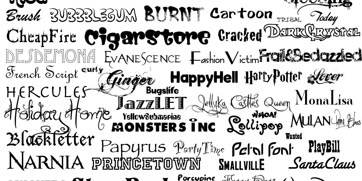
Before talking about typography’s role in art and the way art can be conveyed through – or, better to say, with the help of – typography, it is worth mentioning that typography itself is already art. Some people understand and very broadly define typography as the way a text is arranged and presented. However, the definition of typography goes far beyond that. Actually, the Oxford Dictionary states that typography is the art of arranging letters and words. Thus, this technique makes the text clear, legible and visually appealing to the reader. Font style, appearance and structure are all involved in typography and those features aim to convey certain messages and evoke specific emotions. The chosen typeface and the way it works with the layout, grid and colour scheme will influence the text greatly because typography is what brings the text to life. That is the reason typography is so meaningful.

Straight after the creation of writing, people were surrounded by texts. Typography, however, can be dated back to the 11th century, when movable type was innovated. Since then typography started to associate with books, magazines and newspapers. Even bigger amounts of letters and texts were out there, flooding with words everything around. However, nothing can be compared to the way we are dived into typography now, in our digital age. The birth of the Internet has given some sort of a creative explosion to the art of typography. Suddenly, web designers had an abundance of fonts and type options at their disposal, making typography more visually diverse than ever before.

Typography is so much more than just choosing beautiful fonts. Good typography guides and informs viewers, optimizes accessibility and readability, establishes a strong visual hierarchy, provides a graphic balance. It can build brand recognition, it can influence our decision-making, it is what holds our attention as readers. More to that, it can manipulate our feelings and emotions. As Cal Swan, the author of ‘Language and Typography’, once said: “…there is clearly a very strong relationship between the conception of the words as a message and their transmission in visible forms’.
Let’s have an example. A pair of illustrations, with the same word written on them. The word is the same, but its typography and positioning are very different. The first illustration shows a large bold lowercased word, closely kerned and positioned right in the middle. All those characteristics make the word loud and dominant, and the message comes across as friendly, enthusiastic and confident.
Another illustration embodies a dramatic contrast due to the choice of type, font, scale and positioning. Despite featuring the exact same greeting, this typography makes us feel it as more distant, hesitant, even anxious. This example illustrates the varied and emotive effects that can be achieved by changing just the visual language of a message, while still presenting the same verbal language.


We live in a typographic wonderland and it is simply amazing how strong the effect that typography has on words, texts, meanings and feelings is. Pure art, is it not?
